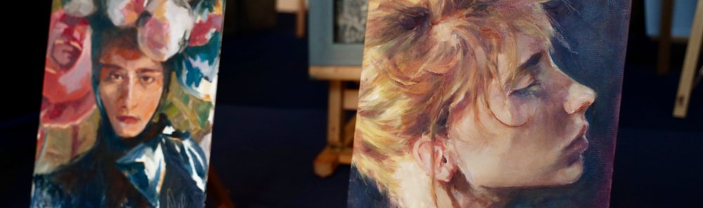
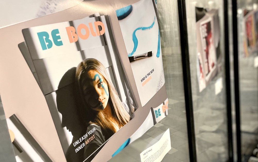
Fine Arts
The Fine Arts at Pacifica is designed to introduce students to a different art medium each semester under the tutelage of local professional artists.
Pacifica students will be tutored through project-based learning while focusing on the fundamentals of Drawing and Painting. New students begin by learning from a method that focuses on developing right-brain perceptions. This method progresses through a series of exercises and techniques that establish a lifelong skill of being able to “draw or paint what you see.”
These techniques are then carried over to the next level of study, as intermediate students take the skills they developed in foundational classes and apply them to principles of design and composition. This will create space for works that begin to tell a story.
Advanced students will be encouraged to expand their artistic eye as they perceive their relationship to the world around them. They will progress by working towards building a portfolio of works that are creative, full of meaning and conceptual in content. Students will come away with a portfolio of works that can be used for college submission, but also documents their progress as they move through each level of Fine Art study at Pacifica.
Students of the Fine Arts will gain confidence in their ability to communicate visually, think creatively, and contemplate beauty as they enhance their endeavors in the arts and in learning to think and live well.
Other Offerings in the Arts
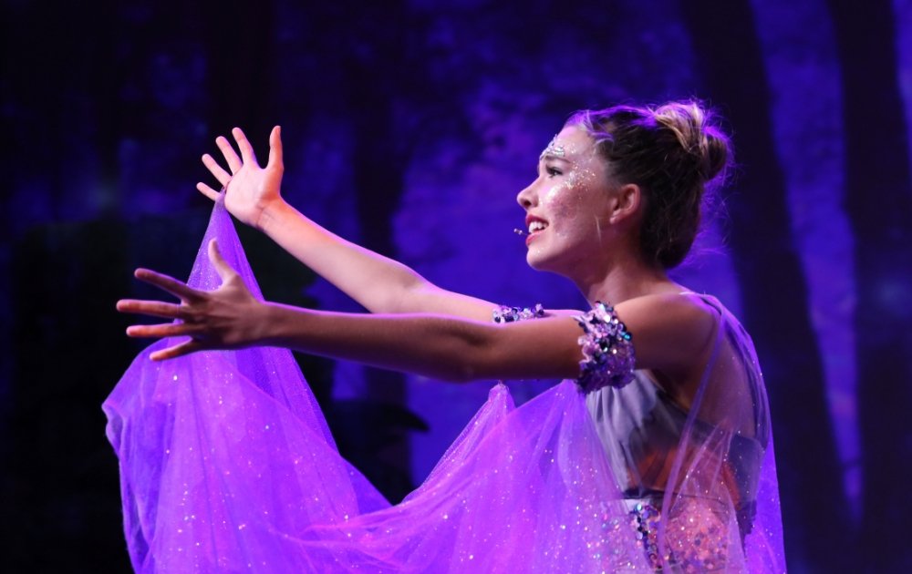
Performing Arts
Performers receive professional mentoring in the fields of acting, dance, music, and vocal performance along with a myriad of opportunities to be on stage.
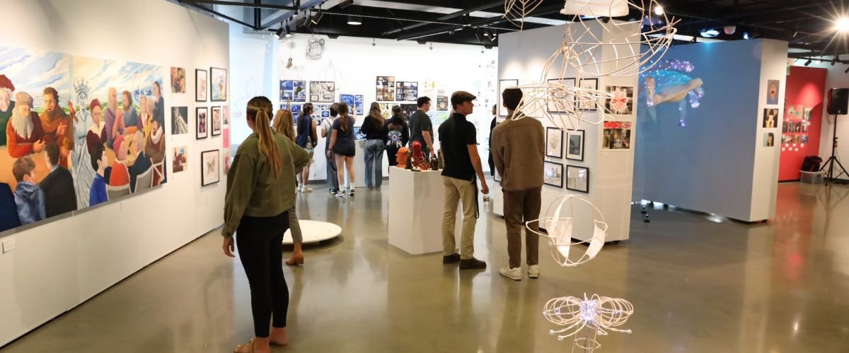
Digital Arts
Digital artists experience comprehensive training in photography, design, and film, complete with seasonal opportunities for displaying their work.

.jpg?v=1677078481949)
_-2.jpg?v=1677078725816)
.jpg?v=1677078837139)