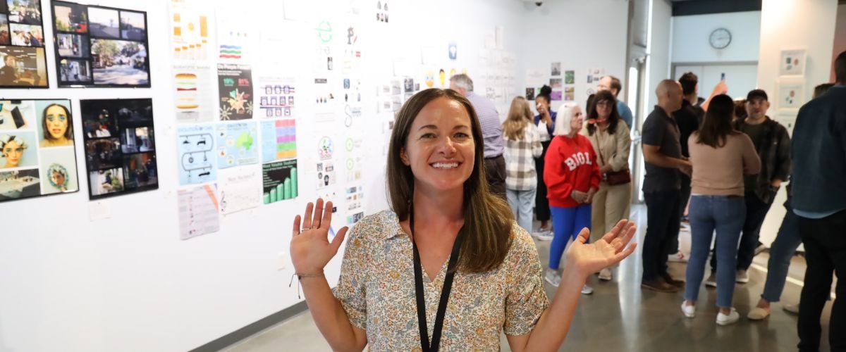
Digital Arts
Digital Arts students partner with the teacher and fellow student artists to obtain the technical, conceptual, and historically-informed artistic tools needed to create original works of art. Pacifica’s Digital Arts courses offer students a comprehensive art experience through drawing, painting, photography, and installation art.
Encouraged to investigate and observe the world around them with a fresh and critical eye, our students explore a wide variety of visual expressions through different media and visual styles. They develop visual literacy by expanding their vocabulary and increasing perceptual awareness of artistic elements. Additionally, students practice their ability to communicate about art and their own work effectively. Through class discussions, critiques, and exhibitions students expand their understanding of artistic choices and outcomes.
At the same time, we continuously explore, articulate, and discuss the greater question of “what is art?” as well as the larger role of art in society. Ultimately, all visual arts classes offer Pacifica students the opportunity to find and define their own voice in the greater art conversation.
Other Offerings in the Arts
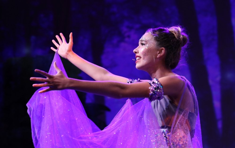
Performing Arts
Performers receive professional mentoring in the fields of acting, dance, music, and vocal performance along with a myriad of opportunities to be on stage.
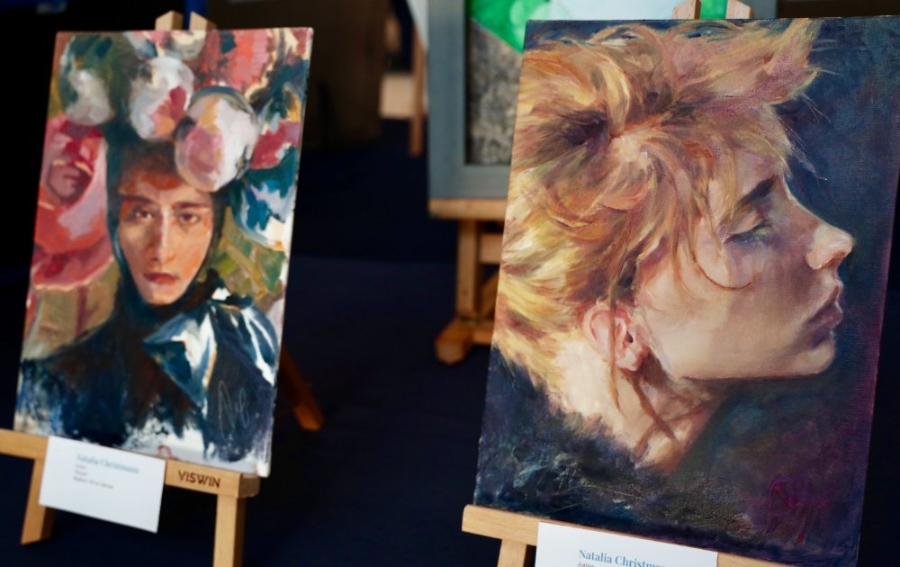
Fine Arts
Artists will gain confidence in their ability to communicate visually, think creatively, and contemplate beauty in drawing and painting, along with seasonal opportunities for displaying their work.

.jpg?v=1677078481949)
_-2.jpg?v=1677078725816)
.jpg?v=1677078837139)